
ARA
Arch Design
CASE STUDY

OVERVIEW
ARA is a Brooklyn based architecture firm working almost entirely with real estate developers, handling architectural layouts, zoning analysis, DOB filing sets, new construction, and conversions. Their clients need approved plans that make the most of a property's square footage, often with unit count tied directly to profit. The identity needed to feel as precise as the work.
THE CHALLENGE
The idea was strong, but the execution needed work.
ARA came in with an existing logo, and the A was already built to reference a building. The client didn't want to lose that. It was the one part worth keeping. The problem was the execution: uneven spacing and imprecise angles made the mark read as rough, not intentional, for a firm asking developers to trust them with high stakes filings.
Color was the second issue. Yellow wasn't wrong for the brand. It's attention getting and energetic. But this specific yellow read closer to construction signage than professional services. The brand needed to land as classic and bold. The current version was just loud.
APPROACH
Taking what worked and developing it further.
1- FIX THE STRUCTURE:
A new typeface corrected the uneven spacing and gave the mark more presence on the page. We redrew the angles inside the A with intention, so the roofline reference reads as architecture rather than accident. We softened the corners slightly, trading sharp edges for a more polished finish. The subhead was spelled out in full, "Architectural Design," set in caps, for a more formal finish.
2- FIX THE COLOR, THEN NAME IT:
The fix wasn't removing yellow. It was finding the right yellow. We built a full palette around a deeper, more deliberate gold: Dust Slate Blue and Dusty Blue as anchors, Golden Yellow as the accent, Chalk White as the base. Naming each color and setting hex values turned a preference into a system anyone on the team could use.
3- BUILD THE TYPE VOICE:
Avenir's heaviest weight (95 Black) for headers gives the same directness as the mark. The lighter weight (35 Light) keeps dense text calm and legible.
BEFORE
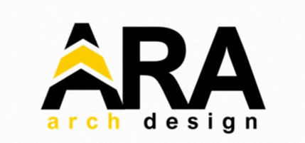
AFTER


EXECUTION
A system that carries the brand across every touchpoint.
We carried the refined system across business cards, email signatures, and two social and ad directions: one built around the gold palette with blueprint imagery, one around real NYC architecture photography with the navy and gold mark overlaid. Both read as the same brand in two different registers.


OUTCOME
A mark that finally matches the work.
The mark now reads as a building, reads as precise, and reads as classic and bold: the qualities a developer looks for before trusting a firm with their next filing. It holds up as a full system now, not just a logo file. The original idea never needed replacing. It needed the structure, color, and type to catch up to it.