
Crème Dessert
CASE STUDY
OVERVIEW
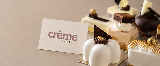
Crème makes miniature desserts for small private events. The kind of thing meant to feel like a considered luxury, not something mass produced. The existing logo had presence. But for a brand this delicate, standing out and feeling right aren't the same thing, and that gap mattered.
OBJECTIVE
Make the logo feel as soft and considered as the product it represents.
The wordmark was getting attention, but tight spacing and hard edges made it feel heavier than it should. It also had nothing that tied it back to what the brand actually makes. This wasn't a case for starting over. The logo already had recognition worth keeping. It just needed to catch up to the product.
THE PROBLEM
The wordmark felt too dense
The spacing and proportions were inconsistent
Nothing in the mark connected it back to the product.
THE GOAL
Make the logo bold enough to stand out.
Keep it soft and inviting.
Keep the premium feel without making it too formal or cold.
VS
APPROACH
The idea was to keep what was already working and refine the parts that weren't.
1 — KEEP WHAT WORKED
The core structure of the logo stayed the same. It was already memorable, so there was no reason to lose that.
2 — FIX THE SPACING
We adjusted spacing, balance, and rhythm throughout the type. On their own, these changes are barely visible. When compared to the original, the difference is evident.
3 — ADD MEANING
We worked a small drop detail into one of the letterforms, a quiet nod to the dessert itself. Most people won't notice it consciously. But it's what makes the mark feel like it belongs to this brand specifically.
BEFORE

Tight spacing made the mark feel heavy
Hard edges made it feel less approachable
Nothing connected it to the product
AFTER - GRID & SPACING SYSTEM

Better spacing makes the mark easier to read
Softer forms feel more inviting
The drop detail adds a small point of recognition

EXECUTION
The updated system is carried across packaging, patterns, and print, built around a neutral palette with soft contrast and tactile finishes. The brand doesn't need to announce that it's premium. The execution does that on its own.


OUTCOME
A brand that matches the quality of the product.
The mark now feels bold and warm at the same time, which it didn't before. And it finally connects to what Crème actually makes, so the logo and the product feel like one thing instead of two.